 |
| BEFORE |
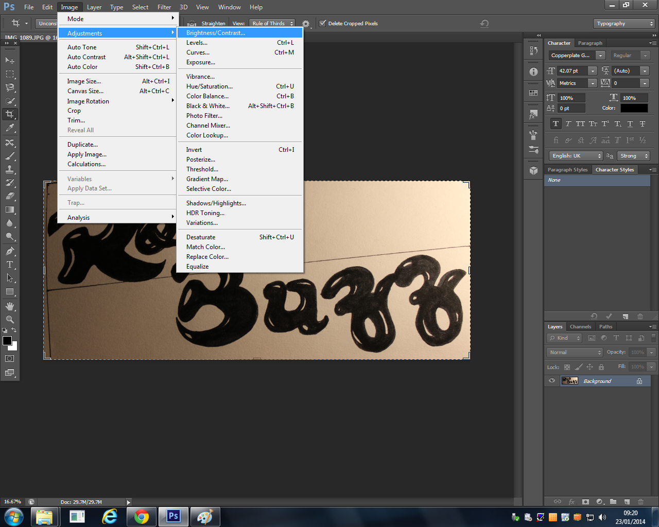
Then the next step was to make it look more digital so by using the brightness and contrast tool I was able to make the text darker and bolder.

After this is accomplished, I opened a new Photoshop file.
And then I used the magnetic lasso on the individual letters and dragged them over to the new file and positioned them in the places I chose for them to be arranged in.
Then the trickiest stage came next, I had to use the paintbrush and go over all the letter to straighten edges or make them neater or to get rid of any white spots.
The last Z was the one I used for both Z's because it was neater and better drawn and i wanted boths Z's to match so the masthead looked more professional.
This was my end result so all I had to do before this was moved over to the cover page was to remove the background layer.


No comments:
Post a Comment