Wednesday, 26 February 2014
Contents Page Idea's
For my contents page i am planning on using the same hand drawn font that i used on the cover and the word 'Contents' will be spread across the top of the page covering the top part of the page. I will only be having one page for my contents and two images. Though codes and conventions may advice me to have more images i am planning on filling the space up with text instead since my music magazine is intended to be 24 pages long. the two images will be cut out and text will go around them so they are not just placed within boxes. There will be no background only white.

Monday, 24 February 2014

Tuesday, 28 January 2014

Thursday, 23 January 2014
Cover Page Photo-Shoot Model Pose
I made my model sit so that I would be able to place all of her on the cover and to show rebellion (which is stereotypically what people think people who listen to rock music are like), this seems rebellious because most cover pages would have a medium close-up shot of their models, so by doing this I am going against codes and conventions. I also sat her so that she would be able to lean the electric guitar against her, by having the guitar feature in the shot it gives the viewer a general idea as to what music genre she belongs to. Also, the guitar is there because red is part of my colour scheme and I wanted to make it apparent by making this coloured guitar part of the main attraction of the cover. I placed her on the right quarter frame so that compositionally it would look good with the cover lines on the left side, and keeping the model in full view (not much covering her.) The cover lines will be on the left side to stick with codes and conventions.
Digitalizing The Masthead
 |
| BEFORE |

Then the next step was to make it look more digital so by using the brightness and contrast tool I was able to make the text darker and bolder.
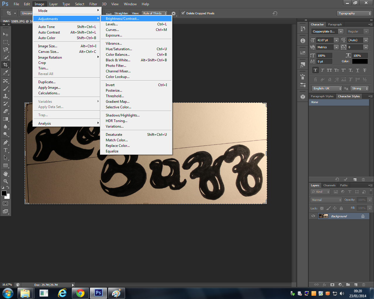
After this is accomplished, I opened a new Photoshop file.

And then I used the magnetic lasso on the individual letters and dragged them over to the new file and positioned them in the places I chose for them to be arranged in.

Then the trickiest stage came next, I had to use the paintbrush and go over all the letter to straighten edges or make them neater or to get rid of any white spots.
The last Z was the one I used for both Z's because it was neater and better drawn and i wanted boths Z's to match so the masthead looked more professional.
 |
| AFTER |
This was my end result so all I had to do before this was moved over to the cover page was to remove the background layer.
Wednesday, 22 January 2014

Tuesday, 21 January 2014
Cover So Far

This is the basis for my cover, I have placed the masthead on the image in the position which was originally planned and have used an outer glow so that the masthead stands out from the image and is readable because at first it blended in with the image too much because they both use dark colours. As you can see the image has been enhanced like I said it would be, I have brightened it up and added contrast so that the background appears whiter and so that the artist almost stands off the page along with the masthead which looks 3D. I did include the idea of using band names to draw attention at the top and have used purple to match the jeans, this text also looks 3D and has a inner shadow and outer glow. The masthead did not originally look like this; the double Z in Buzz was higher. This had to be changed because it looked like it said Buff because of the font style so by moving the Z's down it now looks like Buzz.
Subscribe to:
Posts (Atom)